Python Project: Analysing Australia's Migration Trends and Economic Impact

I’m a Web Developer based in Adelaide, Australia. Even though I have a Telecommunications Engineering degree and an MBA, coding is my passion and my new professional career focus. Developing applications for the web has become my drive.
Python for Everybody Capstone Project
In my recently completed Python for Everybody course, we wrapped up with a capstone project that got me diving into data exploration.
Recently, my attention was caught by discussions and news bits talking about how international migration shakes up Australia's job and housing scenes. So, with my curiosity fired up, I decided to dig into the data, hoping to discover connections between international migration and the trends in these markets.
Being an international migrant myself, I've got a personal stake in understanding how Australia's migration policies and the flow of immigrants play out in the country's economy.
Fortunately, Australia boasts an incredible data gold mine: the Australian Bureau of Statistics (ABS). I managed to search their data and find information about Overseas Migration, Labour Force, Housing Occupancy and Costs, and Total Value of Dwellings.
I initially intended to perform the following tasks with this data:
Database Integration: Import the data into a database for efficient querying and analysis.
Visualization: Generate maps, charts, and graphs to represent migration and economic data.
Economic Impact Analysis: Understand the economic impact of migration on housing and job markets.
Correlation Analysis: Identify potential correlations between migration, labour force, and housing data.
Discover the power of knowledge! Grab my newest free Notion template, packed with detailednotes on 80 specific topicscovered during my journey through the University of Michigan's 'Python for Everybody' course on Coursera. Ready to level up your Python skills?Click here now!
Picking the Data Source
When I first dug into the data from the ABS, I noticed they had it neatly laid out in both MS Excel and CSV formats. Seemed like it could be pretty straightforward to handle, perhaps with a handy Python script.
The topics I was interested in were:
But then, I found out there was another door to this data exploration – an API provided by the ABS. This meant I could easily fetch the data using Python, push it into a database, and then dive into analysis mode. As the API provides an XML response, I could be using ElementTree to parse it.
After trying to build an API request on my own, I stumbled upon a tool that the Australian Bureau of Statistics provides to explore data called Stat Data Explorer. What's neat about it is that it lets you visually explore the data and even generates the right API request for the info you've seen.
So, I ditched the idea of using the initial data from the Excel files and opted to pick out the juiciest datasets for my analysis using this cool tool.
README.md file in my GitHub repository.Building a Data Fetching Script
I kicked things off by creating a nifty Python script called data_getter.py to get the data from the Australian Bureau of Statistics API. As I mentioned earlier, since the data dances in XML format, I enlisted the help of the xml.etree.ElementTree module to untangle its secrets 😅.
For the analysis, I set my sights on the period from 2011 to 2022. Why, you ask? Well, that's because the data for the number of residential dwellings is only available from 2011 onwards, and there was no migration data for 2023 at the moment of working on this project.
Once I processed the XML data, I tucked it neatly into an SQLite database named capstone.sqlite. Why SQLite? Because it's lightweight and easy to use (and the database that we have been using throughout the course).
After analysing it for a while, and a bit of trial and error, I came up with an Entity-Relationship Diagram (ERD) for the database that looks like this:

python3 data_getter.py in your terminal.Building a Data Normalization Script
Once I fetched the data, I spotted a little quirk – it wasn't playing nice in terms of consistency. The count of homes came in quarters, but the job scene spilled the beans monthly. So, I decided to bring order to the chaos and normalize the data, all cosy and snug in a yearly fashion, just like our migration data.
It was now the turn of another Python script: data_normaliser.py. This script not only handles the data makeover but also inserts the revamped data into a squeaky-clean database named capstone_normalised.sqlite. This polished database is all set to steal the spotlight for the grand finale – the analysis and visualization of our data tale.
Data Analysis
Now that our data is all neat and tidy, it was time to roll up our sleeves and dive into the world of analysis and visualization. To kick things off, I created a Python script called data_stats.py that churned out some essential statistics to explore:
Migration
Year with highest migration
Year with lowest migration
Average Migration per year
Average Migration per state
Employment ratio
Year with highest employment ratio
Year with lowest employment ratio
Average employment ratio per year
Average employment ratio per state
Dwellings (quantity)
Year with highest dwellings number
Year with lowest dwellings number
Average dwellings number per year
Dwellings (price)
Year with highest dwelling price
Year with lowest dwelling price
Average dwelling price per year
python3 data_stats.py in your terminal if you are following along.This is an example of the output of the script:
➜  capstone_project git:(main) ✗ python3 data_stats.py
Getting migration data from database...

    == ---------------------------------------- ==
       Migration statistics
    == ---------------------------------------- ==
    Highest Migration year was 2022 with 422,230 migrations.
    Lowest Migration year was 2020 with -20,370 migrations.
        The Migration variation between the highest and lowest year is about 20.73 times the lowest year.
    Average Migration per year is 45,061 migrations.
    Average Migration per state is:
        New South Wales: 70,884 migrations
        Victoria: 61,682 migrations
        Queensland: 29,642 migrations
        South Australia: 11,857 migrations
        Western Australia: 21,871 migrations
        Tasmania: 2,165 migrations
        Northern Territory: 1,685 migrations
        Australian Capital Territory: 2,979 migrations
        Australia: 202,784 migrations

Getting employment ratios data from database...

    == ---------------------------------------- ==
       Employment Ratio statistics
    == ---------------------------------------- ==
    Highest Employment Ratio year was 2017 with 73 %.
    Lowest Employment Ratio year was 2013 with 55 %.
        The Employment Ratio variation between the highest and lowest year is about 1.33 times the lowest year.
    Average Employment Ratio per year is 62 %.
    Average Employment Ratio per state is:
        New South Wales: 60 %
        Victoria: 61 %
        Queensland: 61 %
        South Australia: 58 %
        Western Australia: 64 %
        Tasmania: 56 %
        Northern Territory: 70 %
        Australian Capital Territory: 68 %
        Australia: 61 %

Getting dwelling numbers data from database...

    == ---------------------------------------- ==
       Dwelling Number statistics
    == ---------------------------------------- ==
    Highest Dwelling Number year was 2022 with 10,907 (x1000) dwellings.
    Lowest Dwelling Number year was 2011 with 74 (x1000) dwellings.
        The Dwelling Number variation between the highest and lowest year is about 147.39 times the lowest year.
    Average Dwelling Number per year is 2,201 (x1000) dwellings.
    Average Dwelling Number per state is:
        New South Wales: 3,080 (x1000) dwellings
        Victoria: 2,545 (x1000) dwellings
        Queensland: 1,976 (x1000) dwellings
        South Australia: 764 (x1000) dwellings
        Western Australia: 1,049 (x1000) dwellings
        Tasmania: 241 (x1000) dwellings
        Northern Territory: 81 (x1000) dwellings
        Australian Capital Territory: 166 (x1000) dwellings
        Australia: 9,909 (x1000) dwellings

Getting dwelling prices data from database...

    == ---------------------------------------- ==
       Dwelling Mean Prices statistics
    == ---------------------------------------- ==
    Highest Dwelling Mean Prices year was 2022 with 1,170 (x1000) AUD.
    Lowest Dwelling Mean Prices year was 2012 with 297 (x1000) AUD.
        The Dwelling Mean Prices variation between the highest and lowest year is about 3.94 times the lowest year.
    Average Dwelling Mean Prices per year is 576 (x1000) AUD.
    Average Dwelling Mean Prices per state is:
        New South Wales: 810 (x1000) AUD
        Victoria: 671 (x1000) AUD
        Queensland: 514 (x1000) AUD
        South Australia: 453 (x1000) AUD
        Western Australia: 551 (x1000) AUD
        Tasmania: 401 (x1000) AUD
        Northern Territory: 473 (x1000) AUD
        Australian Capital Territory: 671 (x1000) AUD
        Australia: 645 (x1000) AUD
Data Visualisation
Moving on, I built a Python script named data_visualiser.py to whip up some captivating visualizations. Here's the end result:
A snazzy 2D chart laying out the data landscape on a national scale.
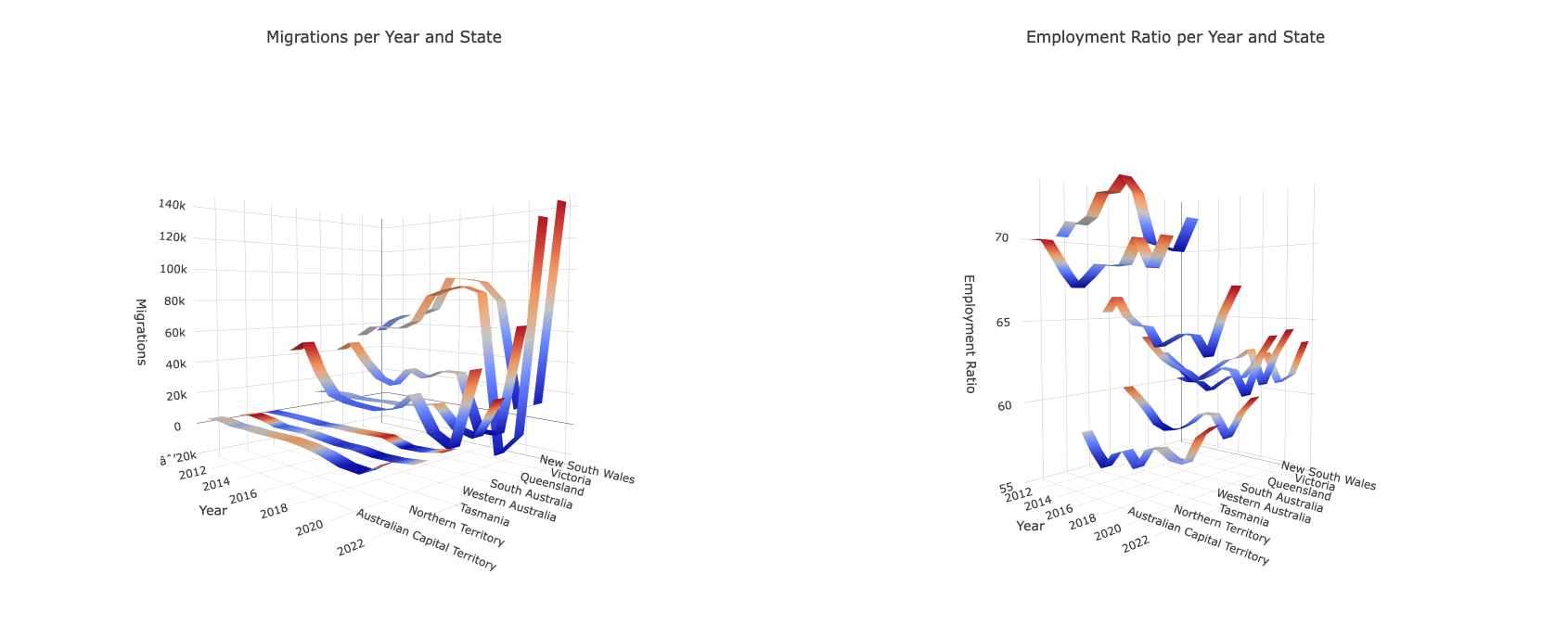
Four dynamic 3D charts, giving us a state-level peek into the data dimensions across Australia.
At first, I gave the 3d.js library a shot for the charts, but it struggled when I tried to juggle multiple data dimensions in the same graph. Not to worry, I pivoted to the plotly.js library, and it played nice, letting me plot those dimensions, but not without breaking a sweat 😓.
Oh, by the way, you can view these charts live online by clicking here!
The result was a grand chart focusing on Migration, Employment Ratio, Dwelling Quantity, and Mean Price nationwide. This beauty allowed me to dissect how these variables dance together and catch any trends. Now, mind you, correlation in this chart doesn't automatically mean causation – there's a whole orchestra of factors for a proper analysis. But for our project's sake, the plotted data paints quite the picture.
In 2020, a noticeable dip in migrations coincided with the aftermath of COVID-19, leading to a significant decline in the Employment Ratio—hinting at a rise in unemployment. The drop in employment is likely a result of the pandemic's impact on the job market rather than a direct consequence of decreased migration. Meanwhile, the number of available homes continued its steady growth, while the average dwelling price started a descent as it approached 2020.
As we stepped into 2021 and 2022, witnessing a resurgence in migration as Australia reopened its borders, a parallel spike in both the Employment Ratio and mean dwelling prices caught my eye. Interestingly, the number of dwellings maintained its consistent growth. The surge in mean dwelling prices during these years could be attributed to the increased influx of migrants, and the fact that the number of dwellings remained unaltered in its tendency, creating a higher demand for houses.
Interestingly, as migration gained momentum in 2021 and 2022, the Employment Ratio also showed improvement, suggesting that the increase in migration didn't negatively impact employment.
I dug into creating four more 3D charts, each showcasing the dynamics of Migration, Employment Ratio, Dwelling Quantity, and Mean Price across different states in Australia. These charts unveil interesting insights, like migrants showing a preference for New South Wales and Victoria. These states seem to play a significant role in the growing number of available homes. Meanwhile, the Northern Territory experiences a more gradual increase in dwelling prices, and its employment market appears to be in robust shape.
Employing a 2D line chart for a nationwide data overview proved effective in uncovering trends and correlations, aligning with the initial goal when first exploring the data. The use of 3D graphs to compare states added a dynamic and engaging layer to the analysis, offering a deeper understanding of the data dynamics across different regions.
python3 data_visualiser.py in your terminal and then opening the charts.htm file in your browser. The raw data for the charts can be found in the charts.js file.Key Takeaways
The lessons learned from this project will undoubtedly have a positive impact on my future endeavours. It served as a platform to apply my recently learned skills in Python, SQL databases, data analysis, visualization, and interpretation. Despite the occasional challenges of navigating through real-world data, it significantly enhanced my problem-solving abilities. In essence, this project has been a valuable learning journey, contributing significantly to my growth as a software engineer.
Discover the power of knowledge! Grab my newest free Notion template, packed with detailednotes on 80 specific topicscovered during my journey through the University of Michigan's 'Python for Everybody' course on Coursera. Ready to level up your Python skills?Click here now!
🗞️ NEWSLETTER -*If you want to hear about my latest articles and interesting software development content, [subscribe to my newsletter](https://mailchi.mp/22b236f812b1/subscribe-to-newsletter).*
🐦 TWITTER/X -*Follow me on[Twitter/X](https://twitter.com/DamianDemasi).*


