My second vanilla JavaScript Project: using APIs, promises, classes, error handling, and more!
I’m a Web Developer based in Adelaide, Australia. Even though I have a Telecommunications Engineering degree and an MBA, coding is my passion and my new professional career focus. Developing applications for the web has become my drive.
Why did I choose to build this project? 🤔
This project was one of my favourite tools for breaking my way out of tutorial hell 👹. I also wanted this project to serve me as a display of my JavaScript skills to potential employers or collaborators.
👉 You can take a look at the finished live project here. 👈
What did I want to implement in the project?
By the time I decided to start working on this project I had just finished learning about Promises, async...await, APIs and error handling. I wanted to code a project to implement all of this knowledge, also include that project in my portfolio, and keep sharpening my design and coding skills 🤓. I usually try to maximise the return on time invested, so I tend to do projects that can serve multiple purposes.
Finally, I also wanted to continue experimenting with the whole process of building a website from scratch. As I did with my previous project, I wanted to gain experience dealing with user stories, the definition of features, and the design stage, and also with the testing and deployment stages. Once more, I also wanted to get a feel of how much work (and time) was involved in the operation.
Time harvesting
As with all the other projects and learning activities I'm involved in lately, I decided to use Clockify (not sponsored by them, yet 😉). I used this app to calculate how much time the different parts of the project will take, and thus have a good estimate in the future to calculate how much time and effort a new project will take me.
The overall process of working on this project, from start to finish, took around 45.5 hours.
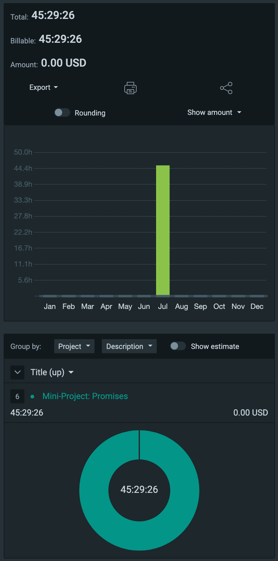
A bit more than 2.5 hours were allocated to API research, 4.5 hours to design, around 14.5 hours to HTML and CSS (mostly CSS… it was a bumpy ride 😅), and the rest to JavaScript.
Choosing the APIs
At first, I didn't know what the project’s theme will be, so I started by researching free APIs to get some insights on what could be done. I great resource that I found is this list of public APIs on GitHub, where APIs ranging from animals and anime to videos and weather, are being displayed.
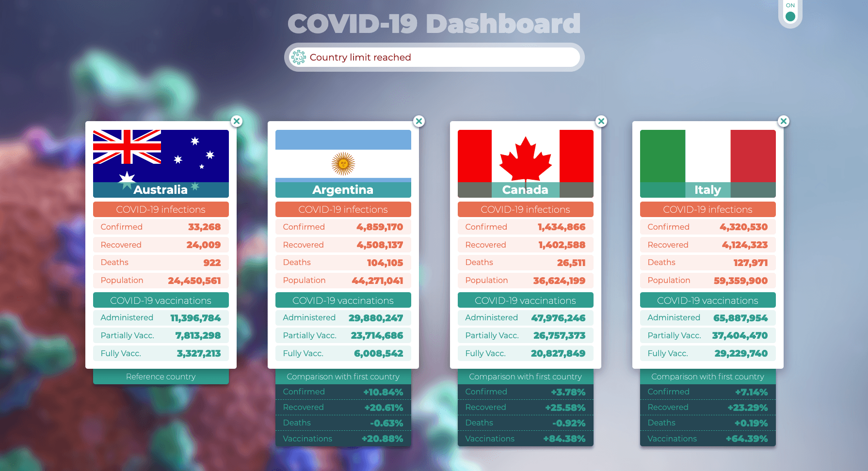
I found a couple of them that caught my interest, and I decided to use one that provides COVID-19 up-to-date data. I imagined that it would be interesting to be able to compare how different countries are experiencing the COVID-19 pandemic and get some insights about their vaccination campaigns (more on this in "User stories"). Plus, we had just entered a new lockdown in my state 😷, so the theme felt right.
Workflow
I followed the same workflow as with my previous project:
Initial planning
- Define user stories
- Define features based on user stories
- Create a flow chart linking the features
- Define the architecture the program will have
Design
- Search for inspiration
- Define colour scheme and typography
- Make a graphic design of the site
Code
- Build HTML structure
- Build the needed CSS to implement the graphic design into actual code
- Build JavaScript code to implement the features defined during the initial planning
Review and deploy
- Test for browser compatibility
- Test for responsiveness
- Validate HTML and CSS code
- Deploy the project
Initial planning
The initial planning for this project was a bit more complex than the one of my previous one, especially because it had many moving parts such as APIs, the creation and deletion of elements, and calculations that needed to be updated “on the fly” 🪰.
User stories
I started by putting myself in the shoes of the users and, thus, I could write the following user stories:
- As a user, I want to be able to get the following COVID-19 information about my country:
- Confirmed cases
- Recovered cases
- Deaths
- Administered vaccines
- Partially vaccinated population
- Fully vaccinated population
- As a user, I want to be able to add other countries so I can compare COVID-19 data between them.
- As a user, I want to be able to delete countries so I can add new ones.
Defining features
Based on the previously defined user stories, I proceeded to determine the features that the COVID-19 Dashboard app will implement. I also include some nice to have features to improve the user experience.
- Get the user’s locale information and render the COVID-19 information for the user’s country.
- Provide a search box with a predefined list of countries to search COVID-19 data from.
- Compare up to 4 countries.
- Provide the user with the possibility to delete compared countries individually or in bulk.
- Provide the user with the possibility to change the comparison reference country.
- Provide a nice-looking background but also allow the user to deactivate it so it doesn’t interfere with all the information that would be displayed.
- Make the app responsive.
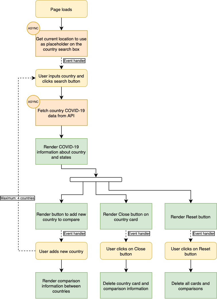
Going visual: making a flowchart
Due to the relative complexity of the app, I definitely wanted to make a flow chart of it to have a clear idea of how the user will be interacting with the page.
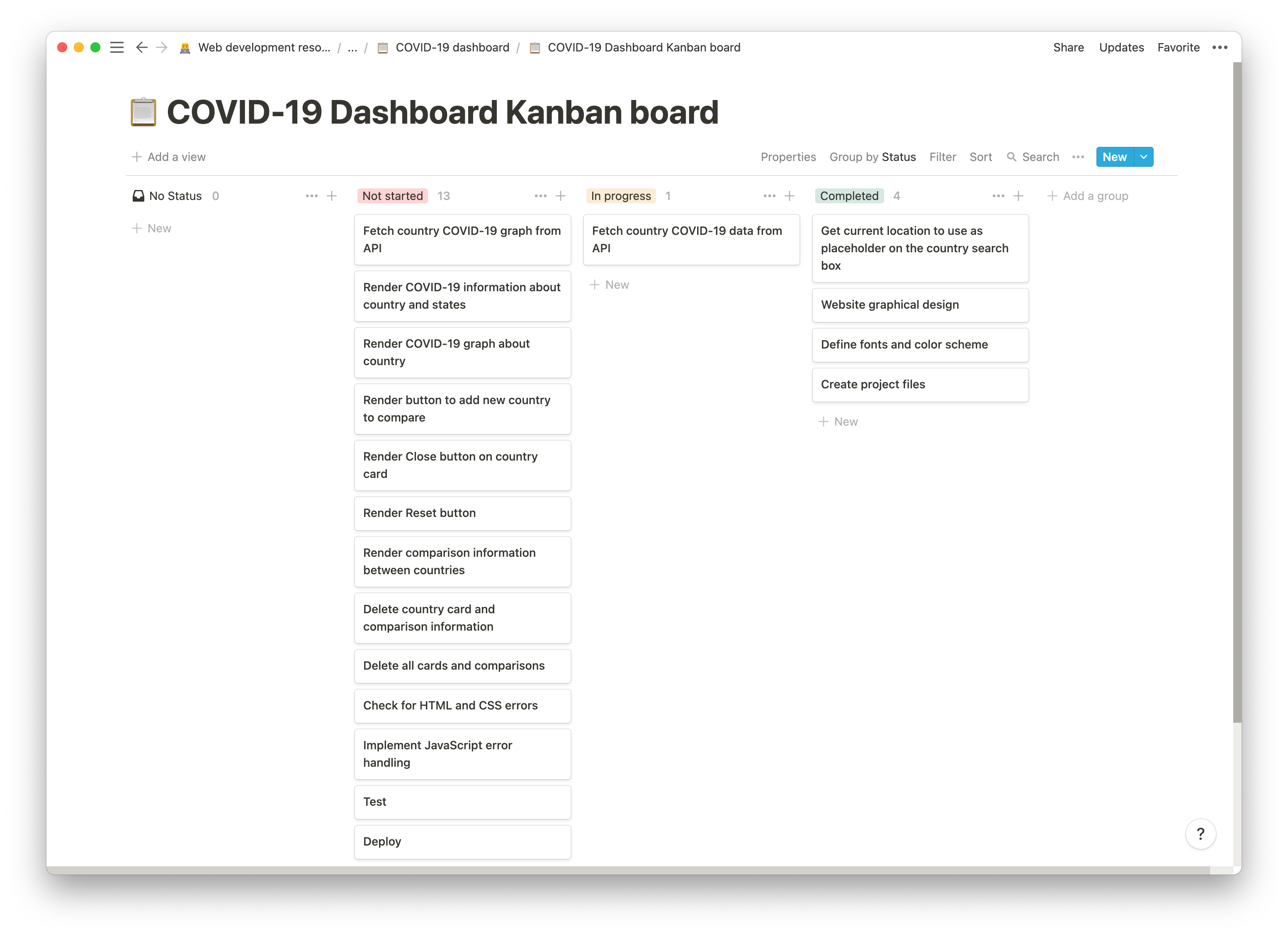
Defining tasks on Kanban board
As with my previous project, I decided to use the Kanban framework to address the defined features and start working on them. In this case, I used Notion instead of ClickUp, to test how comfortable I felt working in this way with Notion, and I must say I prefer using ClickUp due to its better features for this type of work 🤔. Again, I could have used Asana, Trello, or GitHub Projects. I think the tool is not that important as long as there is a Kanban board somewhere (or any other similar framework, for that matter).
In the board, I included the previously defined features, the items created on the flowchart, and the main project workflow elements.
I began by inputting all the tasks and assigning them to the "Not started" column. During the project, the Kanban board was useful to keep track of what needed to get done. This is a snapshot of how it looked during the project:
Design
Searching for inspiration
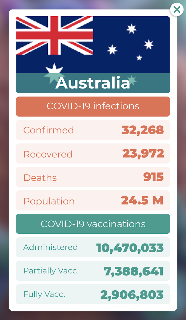
In this project, I knew I wanted to display the information on cards, so I browsed the Internet to see how professional designers had implemented cards in their work. After looking for quite a few designs, I decided to build a card containing the country flag at the top, the COVID-19 infection related information below the flag, and the vaccination information at the bottom part of the card.
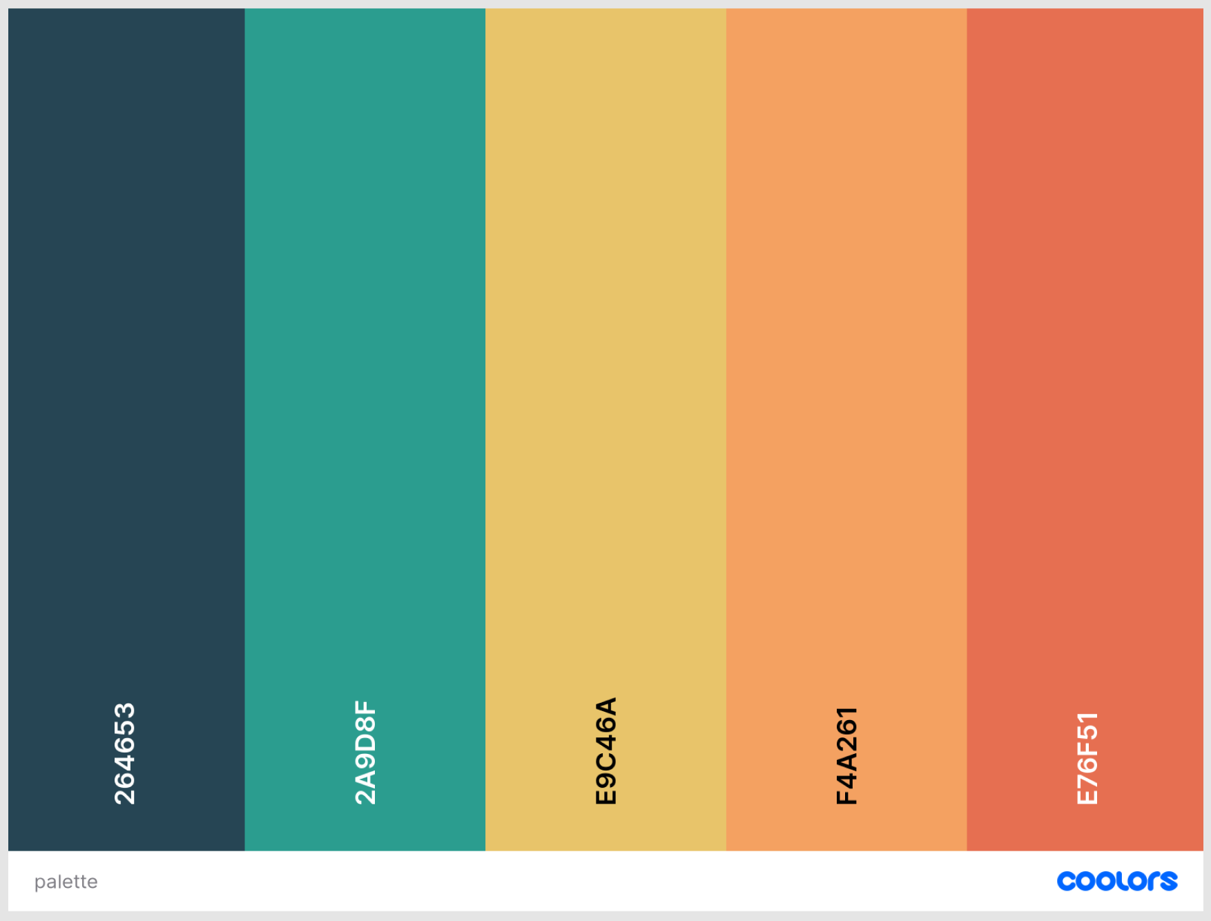
Defining the colour scheme and fonts
When defining colours, I tried to avoid the ones that were too strong or bright, because the user will have to read numbers clearly and easily. After trying many different combinations on the great site Coolors, this was the winner 🥇:
Designing for desktop and mobile
The next step in the workflow was building the design, and I, once again, used Figma. I experimented 🧪 for quite some time testing different card shapes and sizes until I found one that I thought worked well. I also included the colours from the colour palette and the desktop and mobile versions of the design.
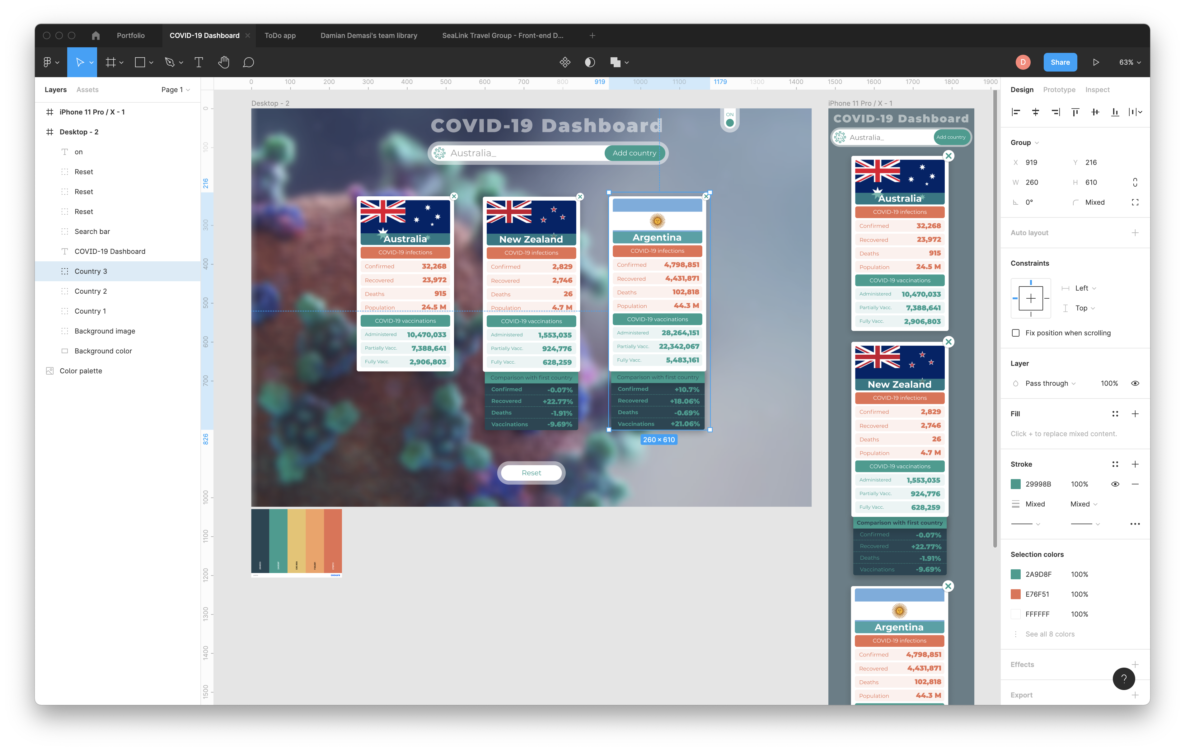
You can take a closer look to this design here.
Coding the foundations: HTML, CSS and JavaScript
Building the HTML code for this project wasn’t too difficult. The index.html document is like a container on which the cards will be rendered using JavaScript code.
You can take a closer look at the source code of this project here.
Going crazy (again) with CSS
Even though the design seems simple, it required considerable effort from me to transform the graphic design into closely enough CSS style 😥.
I experimented with the backdrop-filter CSS property and had to create an alternative for browsers other than Chrome due to support issues. Unfortunately, I discovered that even Chrome presents some strange flickering (or artifacts) when applying backdrop-filter to a big image (such as the one I was using as background), so I ditched the idea of using that property 🤦♂️. Initially I wanted to use it because a simple blur using the filter property leaves a white “border” on the image. I ended up using filter anyway and applying an outline to compensate for the white border. In the end, the user will hardly notice the white border is even there.
Going full throttle with JavaScript
When it came the turn of addressing JavaScript, I started by testing how the APIs worked and how the data they were returning looked like.
I implemented an API ( https://geocode.xyz/ ) for getting the user’s country name by using reverse geocoding. Once that data was available (I used async…await for that), I made use of the name of the country to trigger a new API request ( https://restcountries.eu/ ) to get the country’s flag.
With the data from the first API call or the name of the country entered by the user, I triggered two API requests ( https://covid-api.mmediagroup.fr ) to get the country’s COVID-19 data and the country’s vaccination data.
I employed the data from the API that delivers COVID-19 data to build the list of available countries to get information from, to avoid errors when requesting data for a country that was not supported by the API 🤓.
I used several async..await functions to implement all the API requests and I also employed some “spinners” to let the user know that the site was fetching the data, thus improving its user experience.
I also took advantage of the async…await functions to handle any possible error that could arise from the APIs and implemented a messaging system to render those error messages to the user.
JavaScript architecture
During the time I was working on this project, I didn’t know about MVC or JavaScript modules, so I condensed all the code into a single file. I won’t refactor this code because I think it is a fair snapshot of how my knowledge looked like at the time, but if I was to build it again knowing what I know now, I would implement MVC from the start.
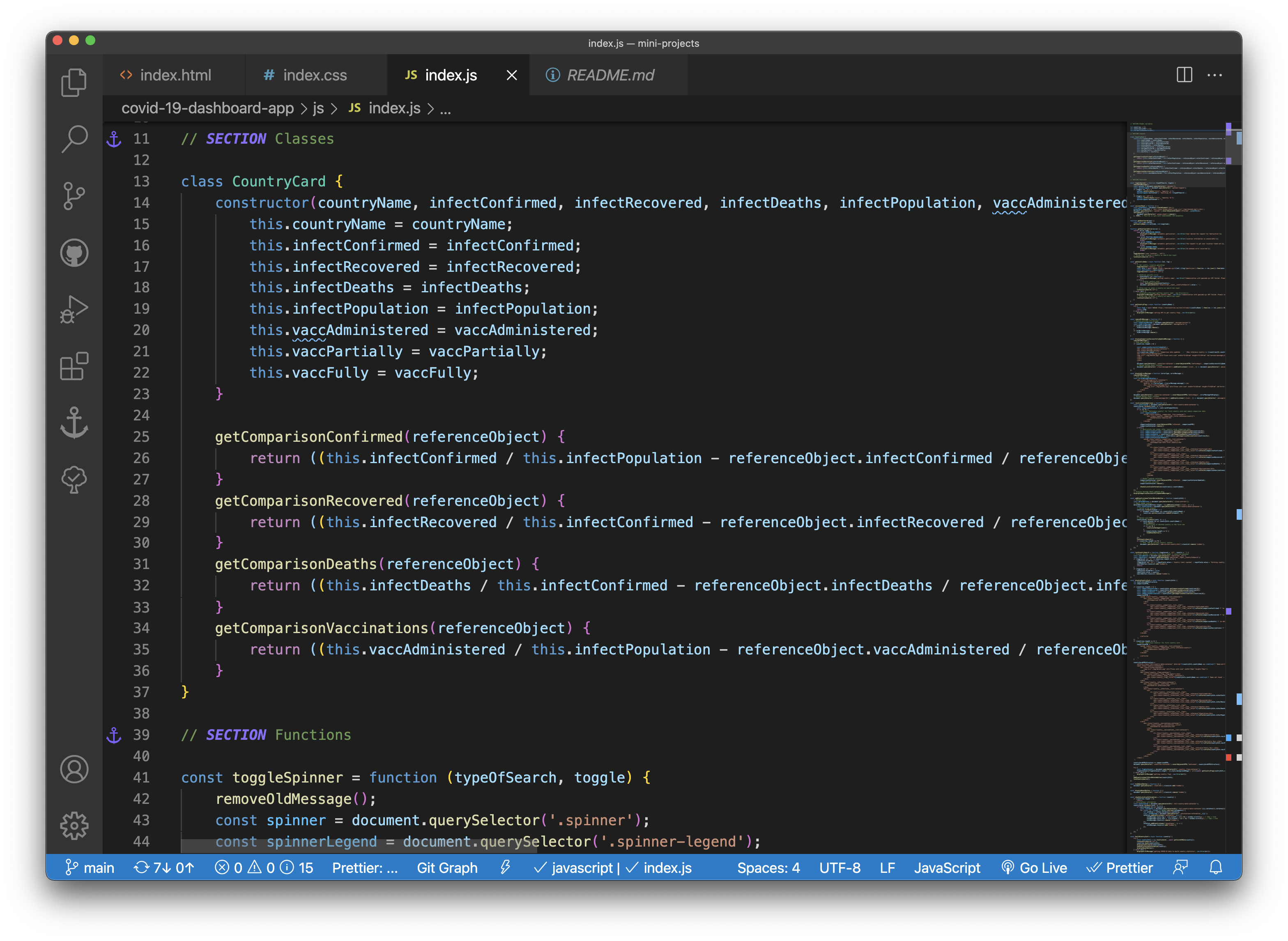
The JavaScript architecture is simple, having one class that is in charge of building the card for each country, and a collection of functions that handle the different interactions with the user.
Testing the app and asking for feedback
As with my previous project, during the building process, I was constantly testing how the app was performing. Doing this pushed me to modify the HTML and CSS code on several occasions.
I asked friends and family to test the app, and they had a mixture of problems with the API used for fetching the user’s country. I wanted to change it for another, more reliable API, but I couldn’t find one.
Publishing
As I always do, I used Git to keep track of the changes in the project and to be able to publish it on GitHub so I could share it with others 🕺.
Due to the experimental nature of the project, I used GitHub pages to deploy and publish the project. I could also have used Netlify or my own hosting service if the APIs I chose were more reliable.
Lessons learned
At the start, this project seemed simple, but it quickly got complicated, especially because I was dealing with three different APIs (and a couple more that didn’t work in the end).
I didn’t spend much time on HTML, but CSS proved to be demanding once more 😅. Thanks to the challenges I faced I gain more CSS skills and learned how to better debug it.
Regarding JavaScript, I could have implemented MVC from the get-go, so I will do that in my next project. As I previously said, I prefer not to refactor this project and leave it as a witness of my skills at the time.
APIs are reliable… most of the time 🤭. I’m sure paid APIs perform better, so if I need to use them in the future for a more serious project, I will research deeply what is the best API to get for the job.
This project still has room for improvement, but I had to make the decision to stop working on it at some point. Overall, I think it’s functioning as expected.
As always, I'm open to any suggestions you may have about this writing or the project itself.
🗞️ NEWSLETTER - If you want to hear about my latest articles and interesting software development content, subscribe to my newsletter.
🐦 TWITTER - Follow me on Twitter.